M. ELYSE DIAMOND
-
HELEN'S GARDEN
Vector and etched methods were used to communicate the rich, floral flavor of the touring garden in this identity system.
-
K+F+B+C HARRY'S NY SALOON
This logo design uses marks, scale, and color to create variations of the Saloon's theme of Knife + Fork + Bottle + Cork.
-
TYPO OHNO COPY EDITORS
Designed to be used as bookmarks, the scale, text, and color of the logo underscore the name and services of Typo Ohno.
-
CARE JOURNAL
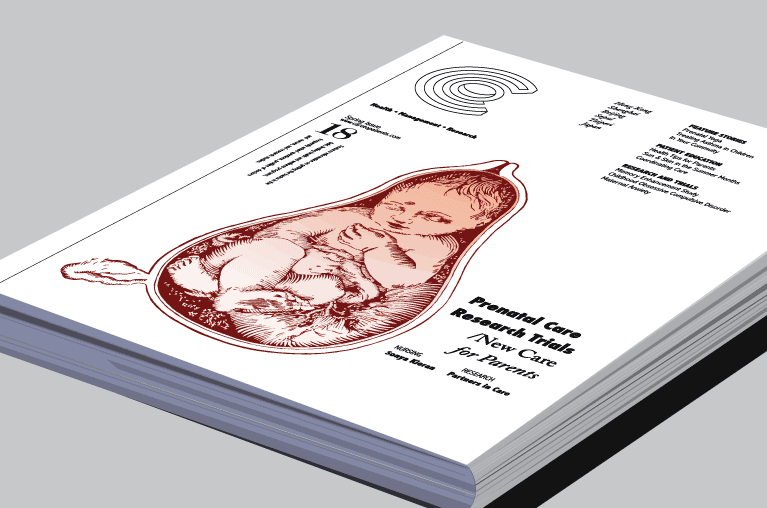
One of a series of layouts, combining a custom-designed C for a logotype and pen and ink illustration styled in Adobe Illustrator.
-
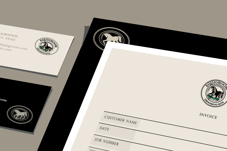
EQUIGROOM
This identity involved developing a sophisticated stamp look that could be flexibly adapted to a broad range of venues.
-
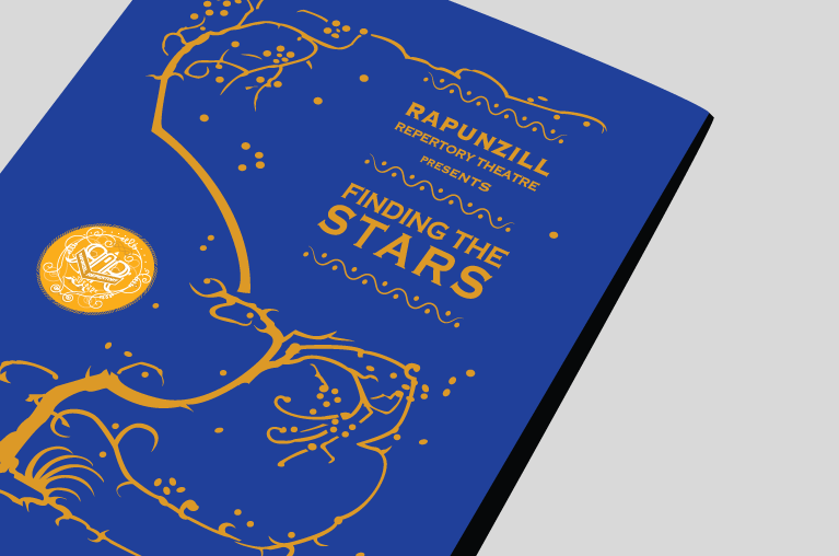
RAPUNZILL REPERTORY THEATRE
This screen-printed playbill features a logo and imagery designed to evoke memories of the Brothers Grimm fairy tale.
-
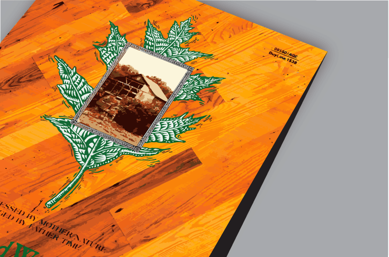
HARD WOOD
Vintage and commercial photography is embellished by an illustration to suggest the quality and endurance of hard wood floors.
-
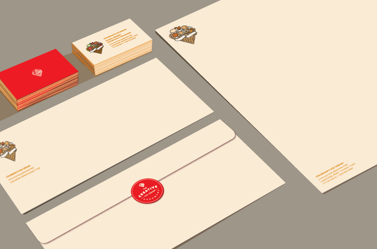
CREATIVE ICE CREAM
The playful use of shapes and subject matter is enhanced with a rich color scheme to differentiate varieties of a line of ice cream.
-
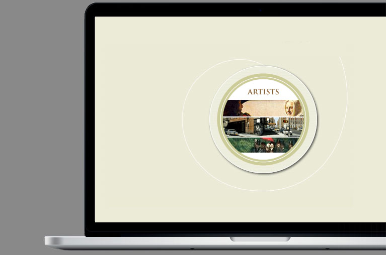
CAMERA OBSCURA
This educational website demonstrates the drawing techniques and methods of camera obscura practiced by artists for centuries.
-
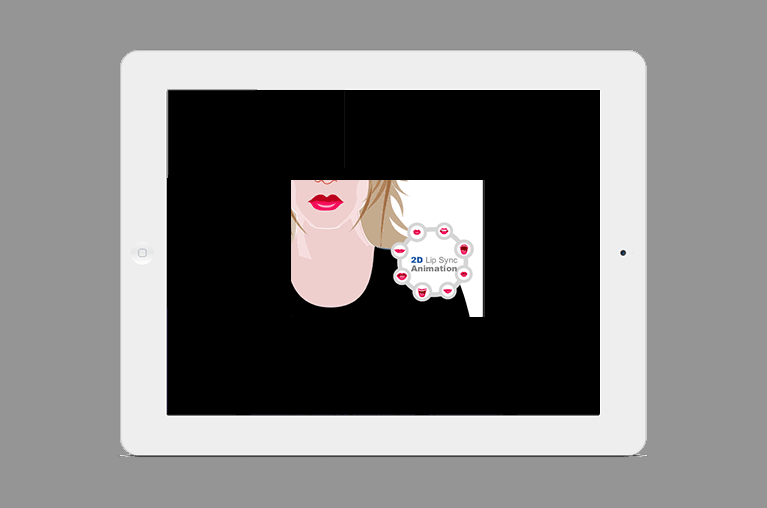
2D LIP SYNC
This educational website provides an overview of lip sync animation with images of visemes to represent human speech.
-
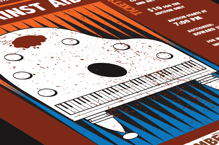
ART AGAINST AIDS
The purpose of this poster is to use the arts as a communication vehicle to raise funds for aids awareness and care.
-
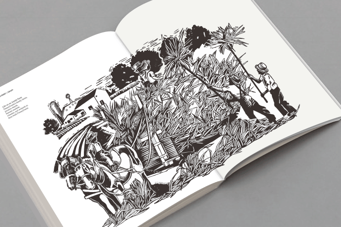
FARM LIFE JOURNAL
This editorial illustration depicts the Amish approach to farming, especially the dynamics of how people interact.